Meet the expectation.
Missing basics can undermine the experience, even when adding them does not feel remarkable.
Protect the foundations of the MVP.Making photo purchases easier to navigate, while deciding what a small team should build first.
Read the story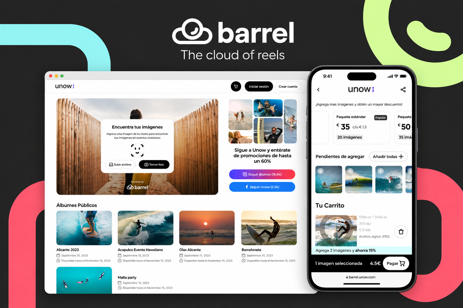
BarrelCloud sells photographs taken during leisure experiences. Visitors need to find their images, understand the available packs and complete a purchase. The business wanted more of that journey to work through self-service, with less dependence on physical sellers.
I joined as a freelance Lead Product Designer for a redesign ahead of a wider park-network opportunity. High season was approaching, development funding was limited, and the CEO had a substantial list of ideas. We needed to decide what belonged in the first release as well as how it should work.
What needs to work before another feature is worth building?
The work covered research, information architecture, wireframes, testing, prioritisation and a reusable Figma UI kit. I also coordinated with outsourced engineering at Unow. An external Barcelona agency handled the rebrand; our interface work needed to fit that direction.
I started with the CEO’s vision and the proposed feature set. We then examined existing Amplitude metrics with help from an external research advisor. Amplitude was new to me, so I worked with someone who could help extract the data we needed.
The team translated the problems into information architecture and wireframes. Interviews and quick guerrilla tests with acquaintances and people we did not know gave us directional feedback before we moved into higher-fidelity iterations.
Support the core purchase journey within the available budget and the approaching seasonal window.
Use existing analytics alongside conversations and observed use to investigate the path to purchase.
Explore the flow in wireframes, test early ideas and refine the higher-fidelity proposal.
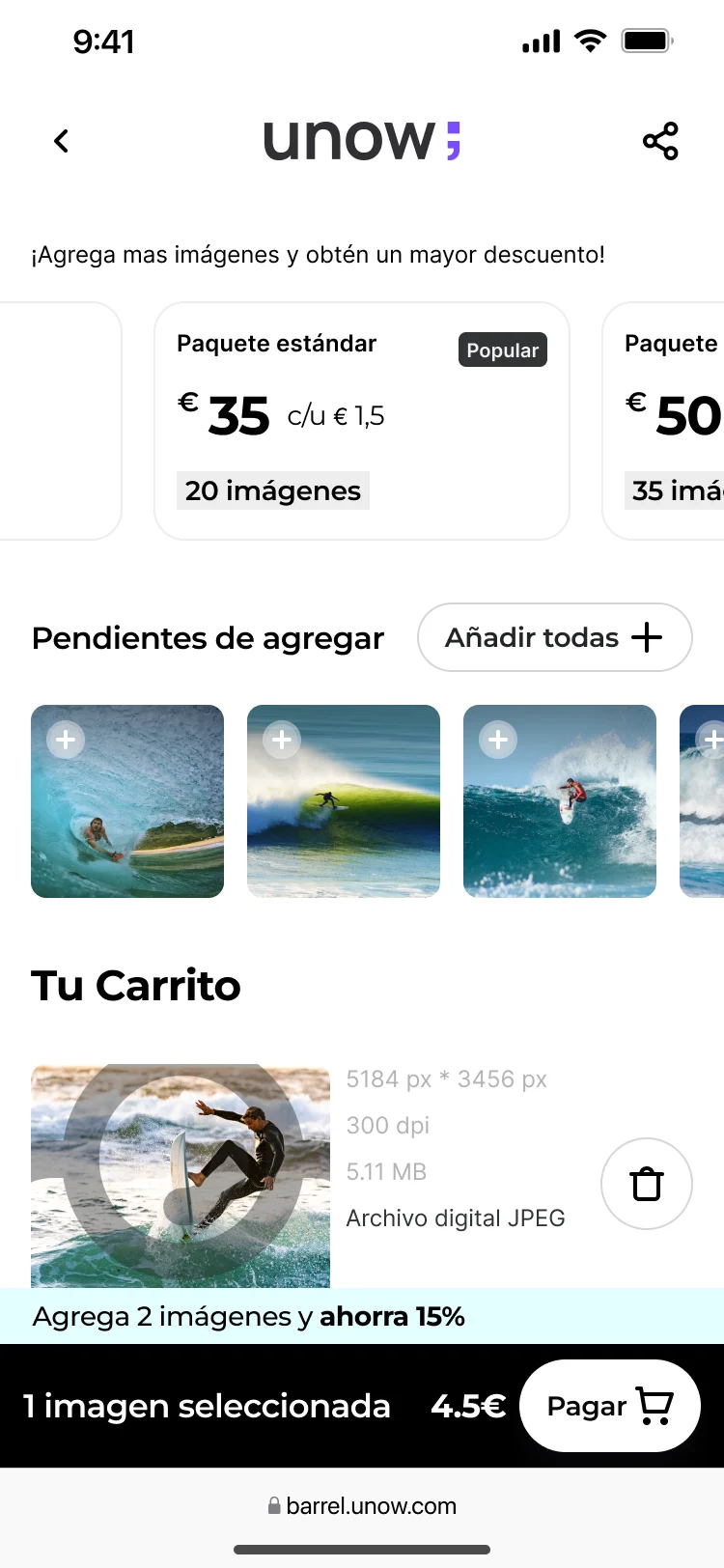
One important difficulty was completing photo selection and proceeding to payment. The rules were more involved than a simple gallery: a pack could contain a fixed number of photos or all eligible photos, and eligibility was tied to a person appearing in them. Group packs introduced another pricing option. The interface had to explain those relationships.
That observation gave us a concrete design problem: help someone understand what they are selecting and what the pack covers before asking them to pay.
The project account documents analytics review, interviews, guerrilla testing and iterative design. It does not preserve a complete recruitment record, task-level test report or reliable participant count. The observations are directional; they are not presented as representative statistics.
The sequence here follows my account of the work. The diagrams are editorial reconstructions, and the interfaces are original exports. They do not constitute a verified before-and-after comparison.
After the early design iterations, we used Kano analysis to challenge the feature priorities. Several ideas near the top of the original list were attractive additions, while basic and performance-related needs remained underserved.
I brought that evidence back to the CEO. We agreed to reorder the MVP so the essentials came first and some attractive functionality moved to later releases. The decision helped keep the first release focused on its core value within the available budget and time.
Missing basics can undermine the experience, even when adding them does not feel remarkable.
Protect the foundations of the MVP.For these needs, better fulfilment is associated with greater satisfaction.
Address the underserved core experience.An appealing addition may create delight without being essential to the initial experience.
Move selected ideas to later releases.Kano informed the conversation; delivery constraints still mattered. The practical outcome was a negotiated release order, rather than a claim that every feature in one category must always precede every feature in another.
Kano distinguishes different relationships between fulfilment and satisfaction. Its paired questions examine how people feel when a feature is present and when it is absent. That is different from asking people to rank a wishlist.
The available project account records the broad finding and the resulting MVP decision. The original response matrix, feature-by-feature classifications and coefficients are not available here. This diagram therefore shows the decision logic, not calculated survey results. Specific screen features are not assigned to Kano categories without that evidence.
Method reference: NN/g, prioritisation methods.
The exported screens follow a visitor from discovery to payment and access to their photographs. The useful unit of design is the whole journey: each step should make the next decision understandable.
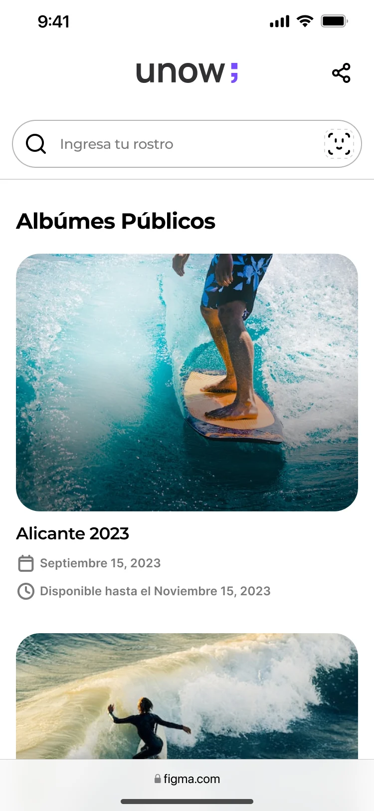
The landing offers a photo-based search and access to public albums. Mobile layouts keep the entry point above the album list. Providing more than one route matters when a visitor arrives without knowing where their images are stored.
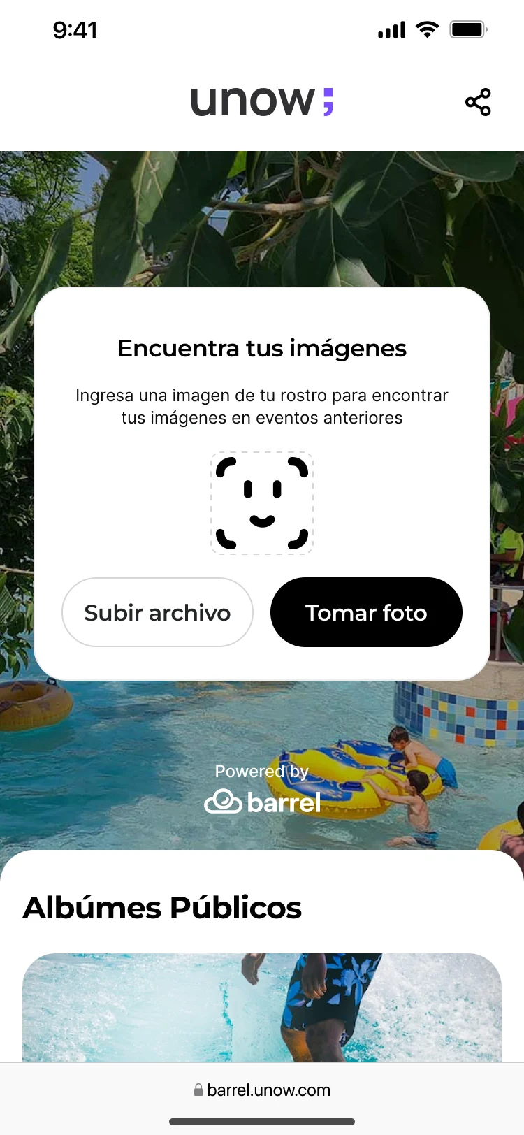
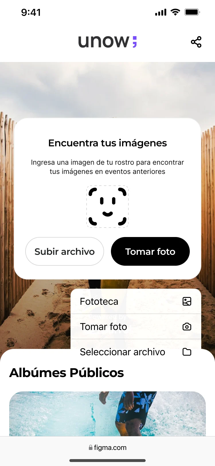
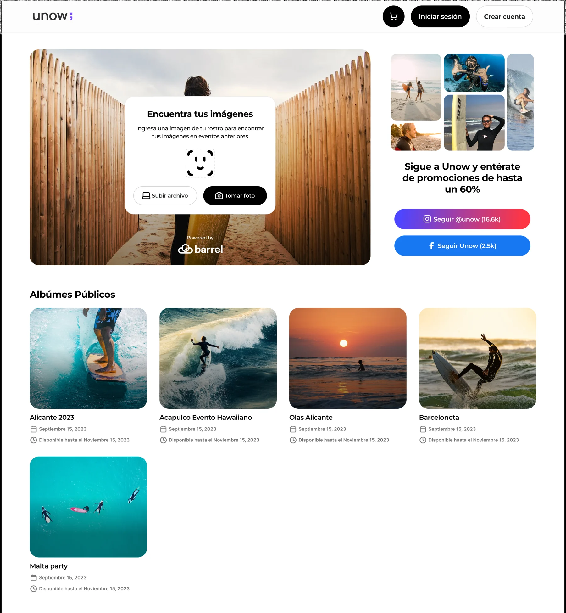
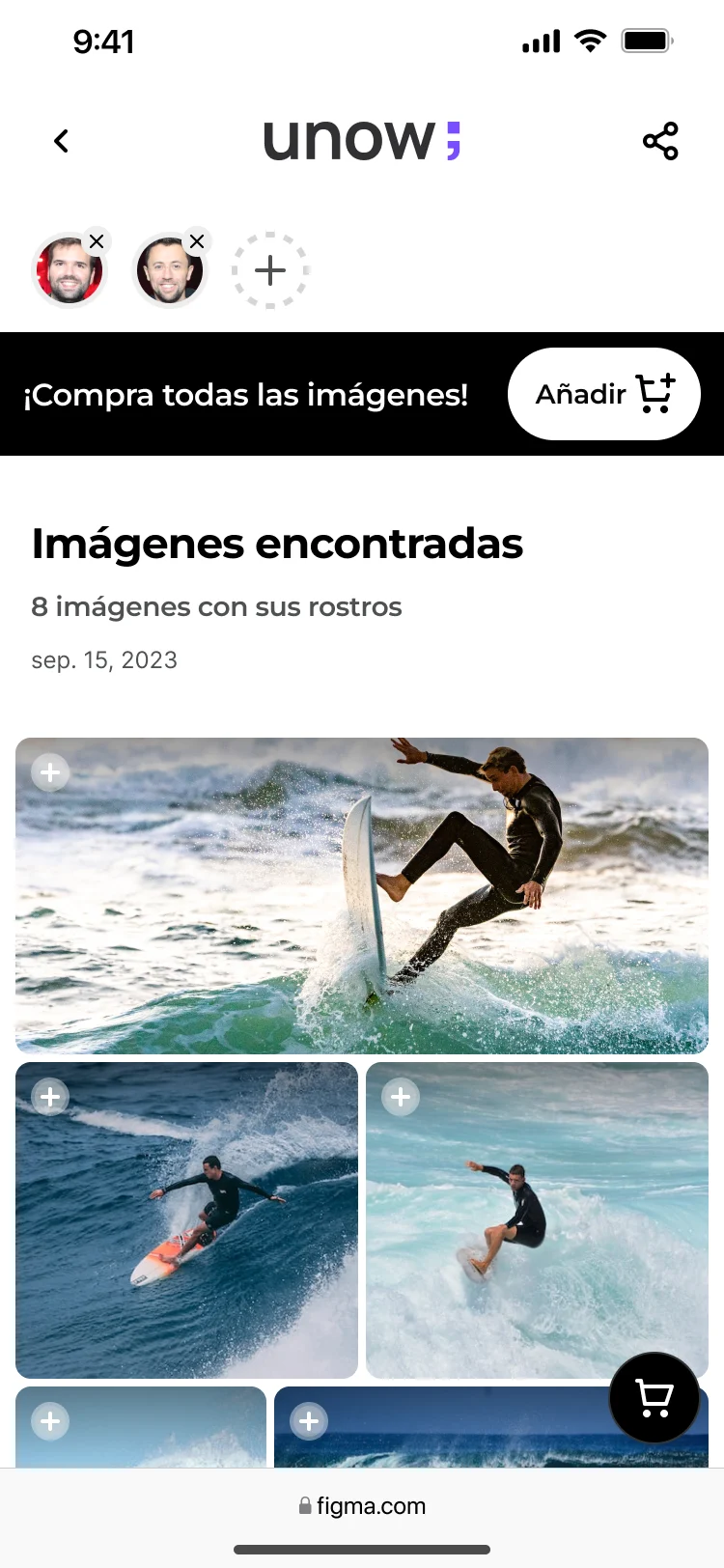
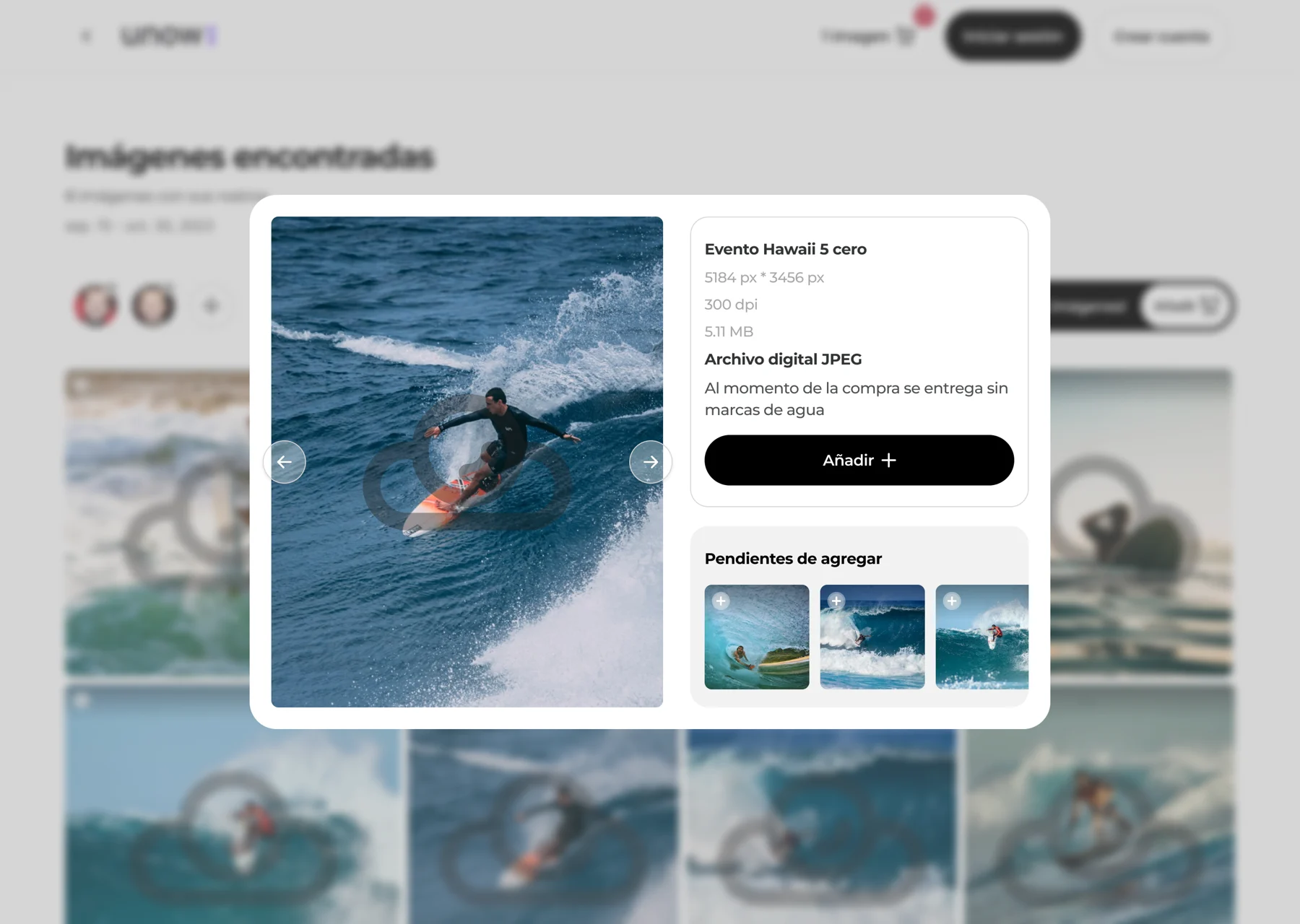
The results bring matching photographs into a gallery. Visitors can review the images before committing to a purchase. The export also includes a desktop detail state, allowing a closer look without replacing the whole gallery.
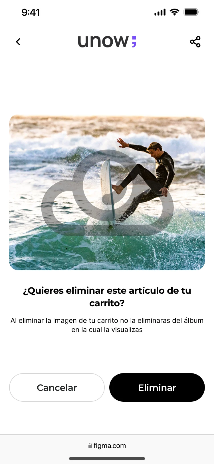
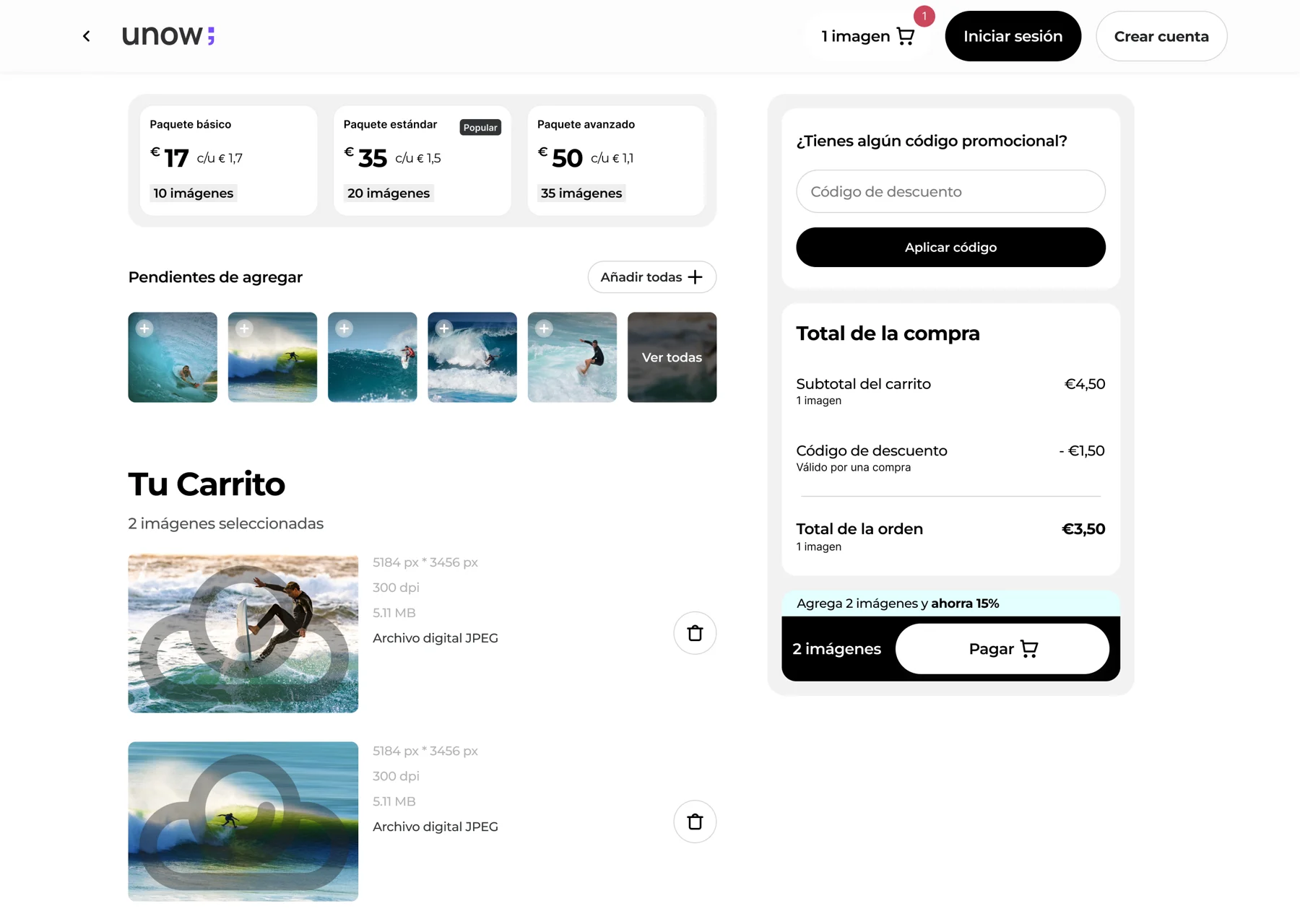
Pack rules and photo eligibility made this part of the product difficult to explain. The cart exposes the selected images and the purchase summary together. A separate removal state asks for confirmation before an image is taken out. These are visible design choices; the archive does not isolate their effect on completion.
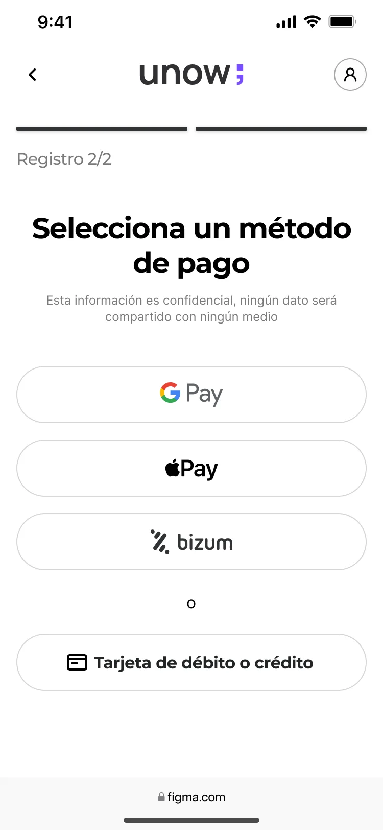
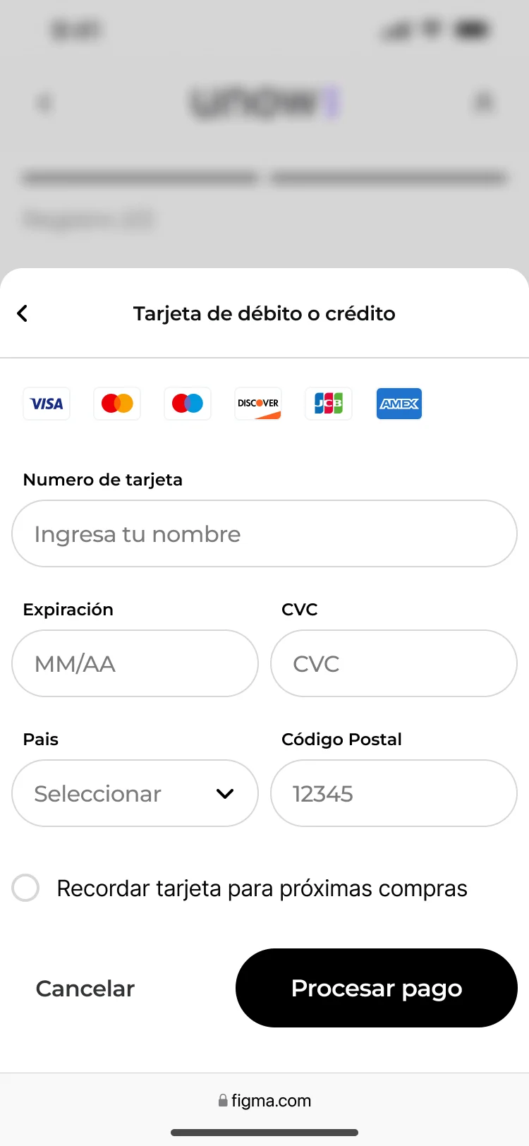
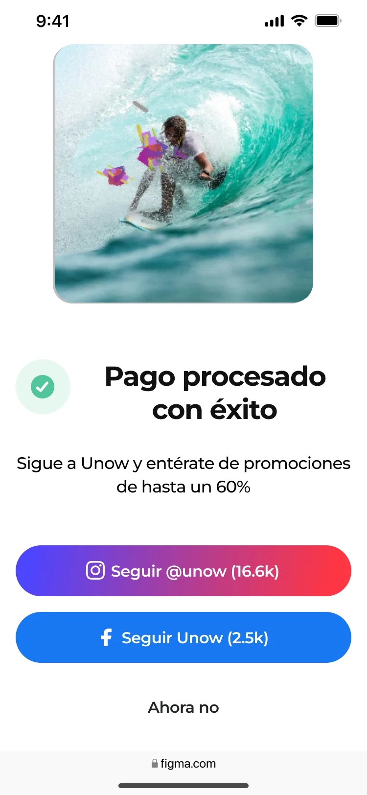
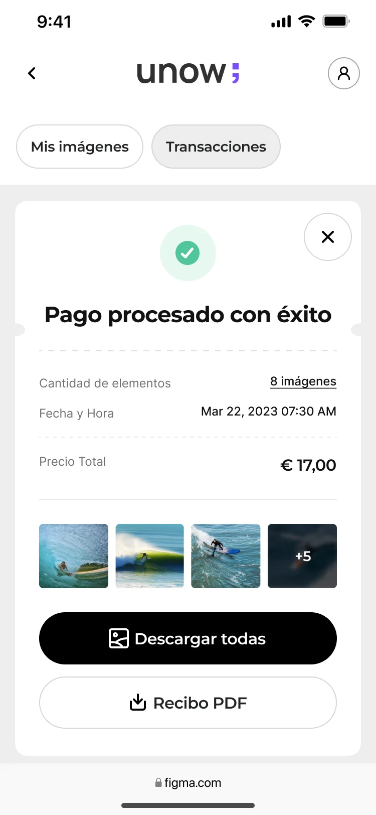
The checkout separates choosing a payment method from entering card details. The following confirmation makes the completed payment explicit and presents the next available actions. Keeping these states in the design means the journey continues beyond the pay button.
Confirmation and account records help visitors return to what they bought. The original exports include a successful-payment state and a receipt with access to the purchased images.
We consolidated the interface into a Figma microsystem and a functional prototype aligned with the external rebrand. Reusable patterns gave the team a common basis for forms, selection, galleries and purchasing states.
When development moved to Unow, I continued coordinating execution. My responsibility extended beyond presenting the design: I stayed involved as the agreed scope became a product.
A Figma UI kit and prototype connected repeated components with the flow they supported.
Our design team worked alongside an external brand agency and the engineering partner.
The CEO and design team had a revised MVP order to guide what came first.
The export set includes search-in-progress, image-detail, removal, payment and confirmation states. They make the work more concrete than a single ideal checkout screen, although exports alone cannot establish which variants reached production.
The redesign reached production, and we followed the purchase funnel and pack selection afterwards. The clearest outcome I can substantiate is the work itself: a revised MVP agreed with the CEO, a redesigned purchase journey, a reusable interface kit and continued coordination through implementation.
The available performance figures are retrospective estimates with inconsistent baselines. Expansion into more parks also complicates attribution. I am not presenting a conversion uplift as a measured result of this redesign.
The lesson I take from Barrel is about sequencing. A team can make a compelling case for an addition while the existing journey still needs attention. Kano helped us make that trade-off explicit and discuss it with the CEO before committing more development effort.
I would preserve the feature-level Kano response matrix alongside the backlog decision and its rationale. I would also keep a clearer link from each observed selection problem to the design change and the task used to test it.
For measurement, I would define the purchase funnel, baseline and comparison period before release, then separate results by park and acquisition context. Selection completion, checkout completion and pack choice would answer different questions. These are improvements I would make today, not measurements claimed for the original project.
The most useful design decision was agreeing what had to come first.
This case brings together my BarrelCloud project account, later clarifications about my role and the photo-selection problem, and original desktop and mobile exports. The narrative is retrospective. Original screen copy and partner branding are retained; the sequence diagram and Kano board were created for this case.
The structure takes guidance from NN/g on UX portfolios: make the problem, contribution, decisions and evidence visible. Google’s Design Sprint Kit provides a useful reference for framing problems, exploring and testing ideas. Barrel’s process is described in its actual order; it is not presented as a completed Google Design Sprint.